Basics of Elementary
There are some simple rules, which should be followed to create functional, easy-to-use task management software and provide people with a joyful user experience.
Let’s observe some of them briefly. (For fabulous English click here.)
Principles of software development.
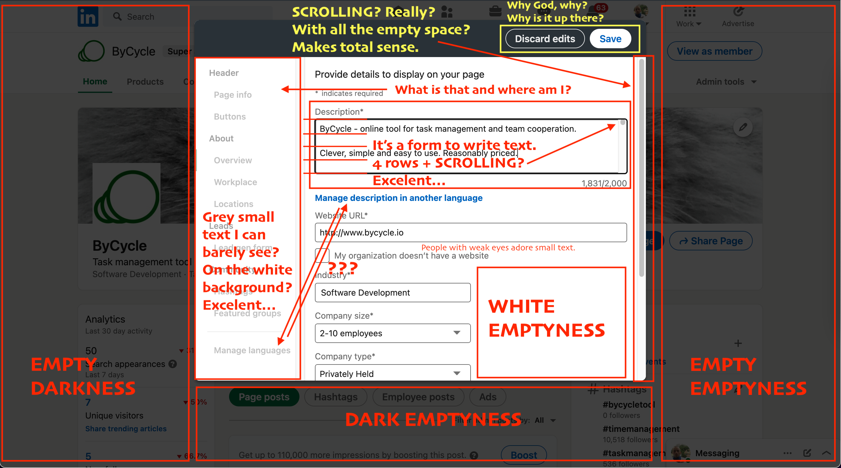
1. Use horizontal space, spare vertical.
It happened to be, that all our screens are album mode and they have more horizontal space, than vertical one. Thus, vertical space is much more valuable and should be saved for content. All horizontal menus are bad by definition. Our greetings to MS Office and almost all modern websites.
2. Small grey text is bad.
Some people have weak eyes, and a small text will definitely remind them about it. But if you want someone to cry in despair, make the small text also be grey. That will make even people with normal vision suffer painfully.
3. Wide text is very bad.
Take any newspaper. Have you ever seen a single article printed on the entire width of a sheet? Maybe a title with horse-sized letters. But a text itself – never. It goes in columns and not without a reason. Still, if you have some sadistic bend, then keep it wide and keep the font small and grey – we guarantee, your users will regret they are still alive.
4. Avoid excessive scrolling.
When we work with big data content like tables and long texts, then scrolling (as well as pagination, sorting, filtering, linking, accordion etc) can be a handy option to navigate through a page. But when you have some simple form and you make user scrolling just to press [Confirm] button, it’s annoying to say the least. And it is not smart either.
5. The white colour is aggressive.
Go out of your comfort zone – to a park, for example, and check how much of the white colour would you see around? Unless you are in a dead cold Estonia in the middle of a winter, you will not see much of the white. We like green. It is the colour of the Nature and trees and life. It’s good for our eyes.
6. Place buttons in one place.
Do not be like Gmail or FB or X. They are a monopolies and they can afford to conduct inhumane experiments. But if you respect your users at least a little bit, then make it convenient for them to find and press buttons. Especially those which are used frequently. Nothing makes people feel more hopeless and miserable than buttons randomly thrown around the screen.
7. Use the space.
Theoretics of physics claim that space is expanding, whatever it could mean, but the screen of your notebook does not. All the space we have on the screen is valuable. Think about how to use it. Think really really hard. Do not hide your ignorance behind scrolling, drop-down menus and tiny grey text. The world of the Nature does not bear emptiness. So does not the Virtual world.
8. The user is never stupid.
And most important of all – try to put yourself in your user shoes. Think about why people are using this particular application and what they are going to do here in the first place. Thinking about your software workflow is thinking about people.
Following these simple rules will make all our lives better and might even change the world.
ByCycle.
In ByCycle we are following all the aforementioned principles and even more.
Our main goal is to provide you with a joyful user experience.
It will give you some additional motivation to have the work done.
You will show us your gratitude later by subscribing to an annual plan.
Give ByCycle a try, and see how it works for you.
NB! Use browser version for registration. Mobile version is under development.